Sketchplanations

Explaining one thing a week in a sketch

The Data Prison illustration: shows 2 tables with identical data describing a schedule of work and fun for every day of the week. The "imprisoned" data in the table on the left is separated by lines in a grid. The "freed" data in the table on the right has no lines, and instead uses shading and spacing.

The data prison

The data prison is the default table where the bars of the cells crowd out your data with non-data-ink and lock your data into a prison.

When data is locked into cells, their relationships with other data are harder to see, and the reader has to work harder to learn from your table.

When making a table of data, consider if, by adjusting spacing and alignment, you can make the columns or rows clear enough as they are without the prison bars. And look for opportunities to remove the visual noise to let your data and the relationships between them shine out.

The data prison is a concept from Edward Tufte. Check out the beautiful Envisioning Information

More Tufte sketchplanations:

Keep exploring

Detecting prostate cancer summary - how screening for prostate cancer has changed DRA, PSA blood test and MRI screening compared in the old way and new way
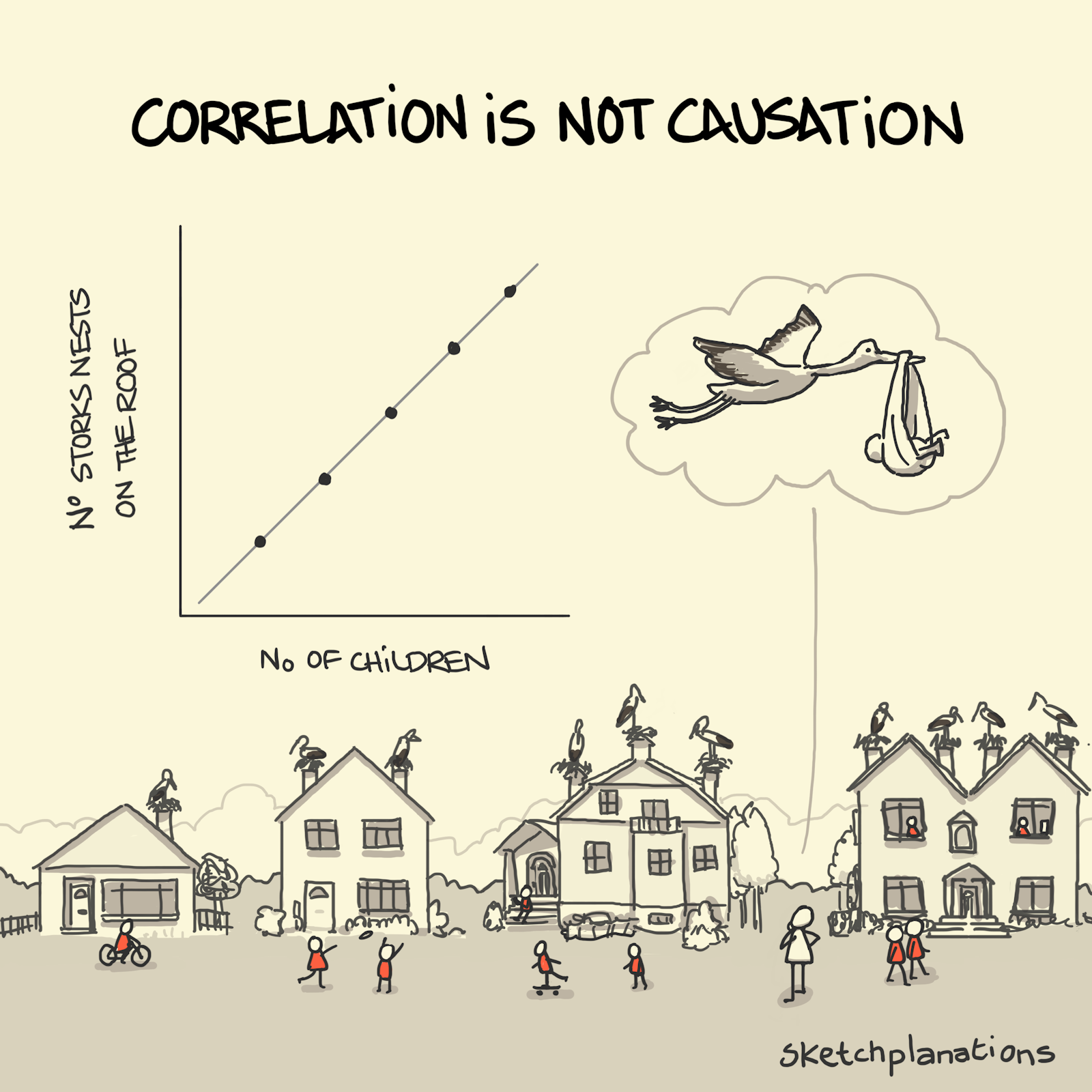
Correlation is not causation illustration: A chart of the correlation between storks nesting on roofs and children in a household is shown above a street of progressively larger family houses with more and more storks and someone wondering if the storks are bringing the babies
Two people enjoying a dialogue, one falling asleep to a monologue, and one being distracted from their book by a halfalogue
Buy Me A Coffee