Explaining one thing a week in a sketch
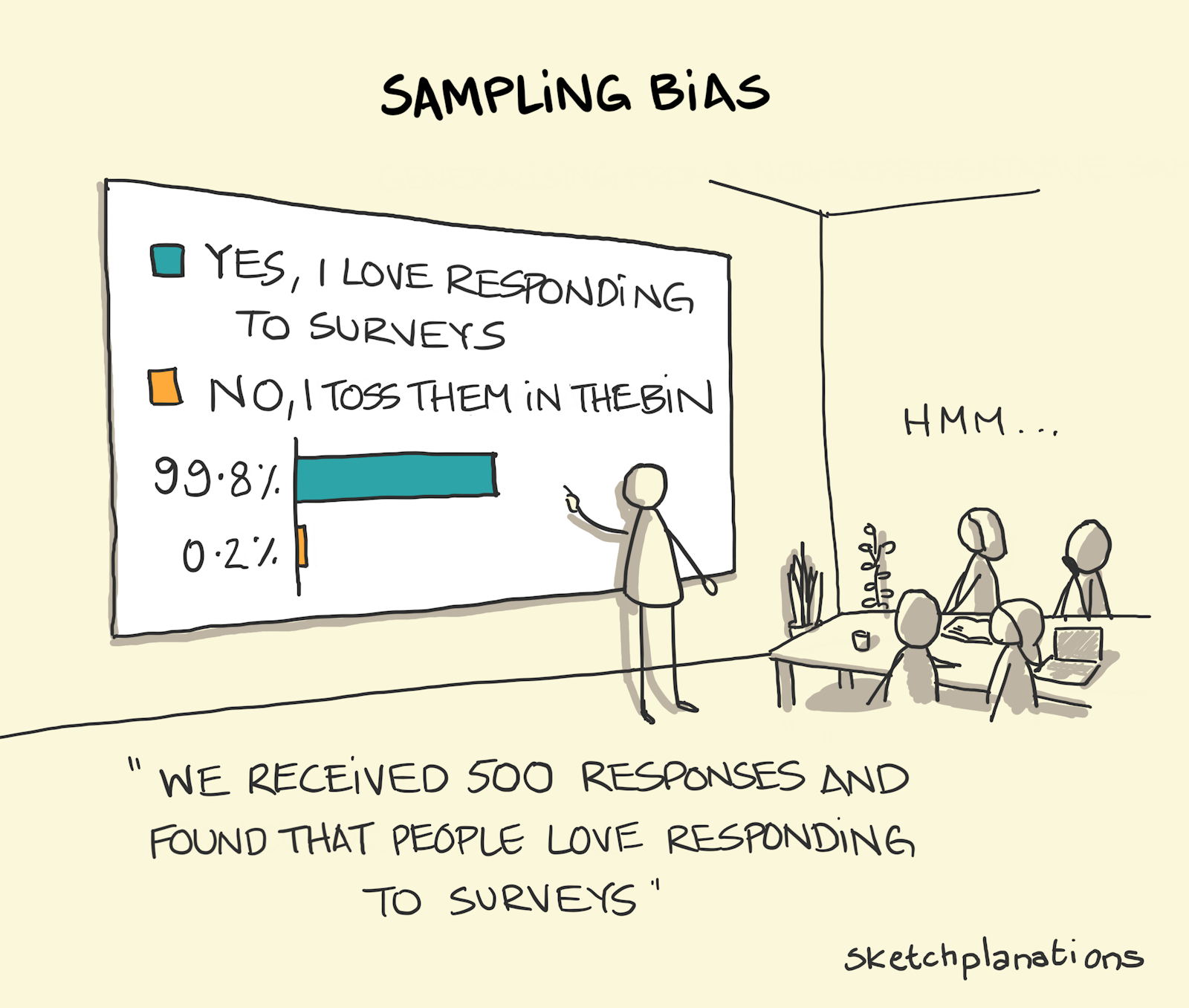
Sampling bias
If you wanted to know who would win an election, then the only reliable (most of the time) way to do that is to ask everyone to vote for real and count them all. Short of doing that, if you want to get an idea who would win you can pick a group that you hope is representative of the whole of the voting population, ask them what they plan to vote instead, and then multiply up to the full group. But it turns out, whenever you ask people things, it's jolly hard to really have confidence in what you're extrapolating up to as all sorts of bias can creep into your sample.
If you ask people what they plan to vote they may lie, they may tell you what they plan to do then change their mind, they may tell you what they think you want to hear depending on who's asking, they may say the first option because it's easiest, and you may ask in the places where it's easy or cheap to do so, or hear from only the people who are happy and not too busy to talk with you.
In the example in the sketch, if you hope to receive responses to your questions by surveys then you get responses from people who happen to not mind doing surveys — from anyone who throws them in the bin you won't receive a single data point.
All of these, and others, can lead to a bias in your sample and, at times, to drawing wholly inaccurate conclusions.
Extreme example from How to Lie with Statistics by Darrell Huff.
Keep exploring